Letters for Applique March 18, 2016 – Posted in: Sewing – Tags: applique, tutorial
Far and away the question I get most from readers is asking me about using letters to applique. About a year ago I started sharing my #birthdaypillowcase creations on my Instagram page and every post has people wondering how I do it.

I’m sure Silhouettes and Cricuts would make this task easier, but I’m an old fashioned gal, and I don’t have one of those fancy machines. I’m sure I’m not alone, so if you’re a dinosaur like me and want to know how to choose fonts for applique, read on!
I’ve covered HOW I applique in multiple posts. The most comprehensive of these is the Ultimate Applique post. It covers basics about doing characters and objects with layers of applique. This post contains links to two other posts on a general applique how-to, and how to qpplique curves.

One last note before we get into it: I have been doing this for over 6 years. I’ve appliqued literally thousands of items by now. I’m not trying to brag, I say it because I consider myself to be very advanced in machine applique. It’s going to take patience, practice, and perseverance. But you can do this!!! Just keep trying and don’t give up!
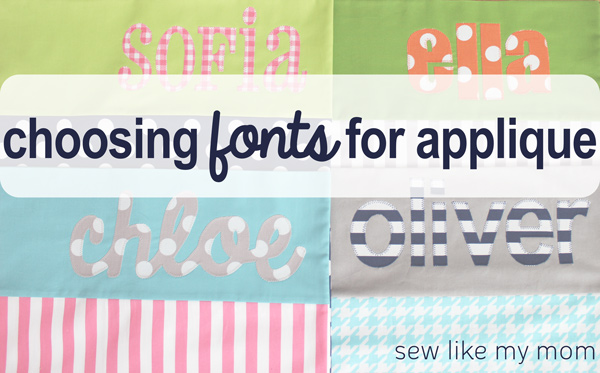
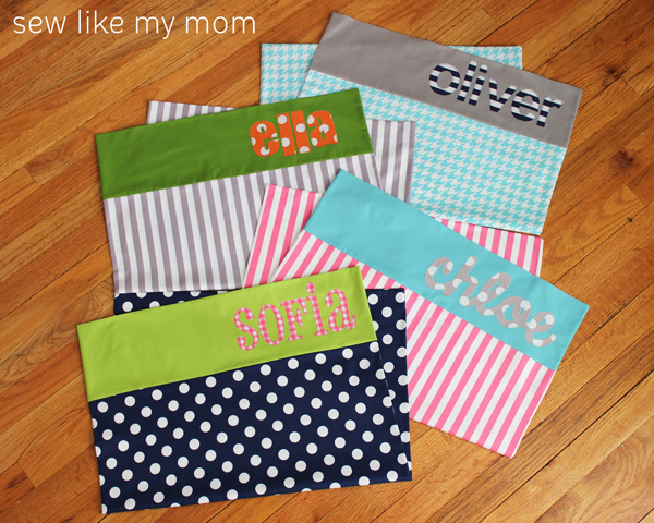
I just posted about making personalized applique pillowcases on Riley Blake. I used 4 different fonts to make my kids names.

So what makes a good applique font? Several things. The best letters will be uniform in size, shape, width, and will be think enough to not only showcase the fabric you use, but also to prevent your stitches from overlapping on each other. Ideal fonts will be sans serif, meaning they don’t have the extra little lines on the letters. It is completely possible to use fonts with serifs, and several that I use often have them, but when you’re learning it really makes it more difficult to be successful. So what does this look like?

The thinner the letter, the harder it is to cut out, manipulate, sew, and it’s not easily readable from a distance. The eye wants things that are clean and simple and it’s vastly easier for you as the creator, too!
These are some of the fonts I’ve been using lately and love. If they didn’t come on my computer, I downloaded them from the internet.

My favorite place to download fonts is dafont.com. When you search, you can specify a word if you’re just wanting to see what that specific thing would look like. Here I searched Sofie’s name and you can some of my different choices. This was just a search under “sans serifs” fonts. Remember, the thicker letters are the better letters. So from these I would choose either the first or third fonts, and not the second and fourth.

This is also neat if you’re looking for a specific font. Lots of movies and characters have their own stylized look and there are fonts out there that mirror the same style. This time I searched Ollie’s name in Star Wars themes. Often times when I need something specialized, I just take a screenshot of the name and blow it up to the right size to trace, I don’t bother downloading the whole font if I don’t think I’ll use it again.

So what are some of my favorites and why? Well, just like fabric, fonts speak to me. Part of the fun for me is deciding which font I think best compliments my fabric. KG Always a Good Time is my FAVORITE script font. It connects the letters, it’s think enough to sew beautifully, and I love the way it looks! I chose it for Chloe’s pillowcase, as well as many others! It’s one of my most frequently used these days.


I forgot to add this one to my list above, but it’s called Cheri and is how I came to find dafont. I used it lots back in my bean bag days, and I still pull it out for names!

This is pharmacy and it’s also a time honored favorite. It’s got some serifs, both straight and bubbly, but it’s always an adorable addition. If you’re just starting out, this one will give you more grief than some of the others. You may want to warm up to it!


Ollie’s pillowcase was made with Arial. This is one of my favorites to use because it’s so crisp, the lines are perfectly straight, which makes it a flash to sew, and between the regular, bold, and narrow options, there’s actually a lot of choices! When I made Ollie’s, I timed myself. This only took me 12 minutes to sew. That won’t be the norm, remember I’ve been doing this loooooots, but sometimes quick is what I need and it definitely gets the job done!

I’ll be honest, I don’t remember what font I used for Ella’s pillowcase. I think it may have been arial black, just because I know how thick those letters are and I wanted to get as much polka dot in there as I could.

This is my latest birthday pillowcase. Chloe went to a birthday party last weekend for a precious little boy in her class. His very favorite thing is skeletons (I love kids!). So I had to hunt around for skeleton fabric in March, but I found some! I considered using a basic font for his name, but I was able to find one that looked like bones so I went with it! I actually really love the way this one came out!

So there you have it, the ins and outs and widths of choosing fonts. Once you get the basics of picking what works best for you you’ll be a fontaholic and downloading them like crazy! And PLEASE tag me on Instagram (@sewlikemymom) if you make these, I want to see them!

1 Comment
Kaholly September 24, 2016 - 05:13
Great resource! Thanks a million!